Stage 1
PROJECT DETAILS
Project Brief
Redesign an e-commerce website for an automotive business in 4 weeks. The design should be dark themed, responsive and showcase products in a minimalistic but informative manner.
A small business was trying to redesign its website to attract automotive enthusiasts across the world. Their current website lacked hierarchy, was difficult to navigate and wasn't responsive on mobile devices.
Since this was an automotive brand that wanted to target a younger market, the client wanted the website to have a minimalistic design that resonated with their target customer. To improve the experience, the website needed to increase customer engagement, revenue, while decreasing shopping cart abandonment.
HIGH LEVEL TIMELINE
I had 4 weeks to redesign, test and launch an
e-commerce website
KEY GOAL
Redesign an e-commerce website to attract Millennial customers
Role and Responsibilities
The website allowed me to become a Product Designer.
This was a large project that needed to be launched in 4 weeks during the COVID-19 pandemic. To create the website, I gathered digital content, redesigned their branding, explored layouts and tested the design with target users on mobile, tablet and desktop screens.
All testing and communication with the client and users were conducted via Zoom. This was because of the Covid-19 restrictions in place at the time.
RESPONSIBILITIES
-
Branding
-
Visual Design
-
Content Creation
-
Usability Testing
-
Launching Website
Scope and Constraints
Before starting the process, I created a list of project constraints that need to be taken into consideration during the process.
After conducting some secondary research, I created a list of project constraints to keep in mind throughout the design process. This included technical, business, and target user constraints. The specific constraints were as follows:
Technical Constraints
-
Including high-quality images may cause the website to load slowly or become unresponsive
-
Information security (address, name, previously viewed products)
-
Needs to be viewable on mobile, tablet, laptops and desktops
-
The website should be branded
Business Constraints
-
Budget
-
Project timelines (4 weeks)
-
Resources (no design or marketing team)
-
No design team to maintain the website (easy to maintain)
Target User Constraints
-
Users won’t consistently use the website the way we planned
-
Security concerns (Banking info)
-
Millennials want automated checkouts
The Process
Day 21-30
Day 1-3
Day 4-6
Day 7-20
.png)
CREATE
MOODBOARD

GATHER
CONTENT

WIREFRAMING
+ DESIGN

PROTOTYPE, TEST
+ ITERATE
-
Create a colour palette
-
A list of words to describe the look of the website
-
Website inspiration
-
Imagery style
-
Design branding
-
Direct product photography style
-
Create copy for product pages
-
Sketch out low-fi wireframes
-
Explore layouts
-
Design Mid-Fi version
-
Conduct 3 Rounds of Usability Testing
-
Integrate improvements
-
Design High-Fi
-
Prototype and Integrate
Stage 2
IDEATION
Moodboard
Before designing the e-commerce website, I created a mood board with website and photography inspiration. This helped me communicate my ideas to the client.
Creating a mood board and establishing the look and feel of the website is an important step in the design process. Since I'm not able to meet with the client in person and they have trouble communicating their ideas, I pulled colours, photography and website layouts for the client to look at. After showing the client the moodboard, they were able to give feedback that helped me determine the look and feel of the website they wanted.

Wireframing
After analyzing my mood board, I starting sketching low-fi wireframes of the mobile and desktop website. I focused on creating a responsive layout centred around bold CTA buttons and product images.
I sketched several low-fi concepts that focused on various layouts and content hierarchy. Since there were several pages that needed to be designed such as home, collection, product and checkout pages, there were many layouts and sketches made.
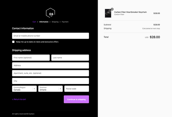
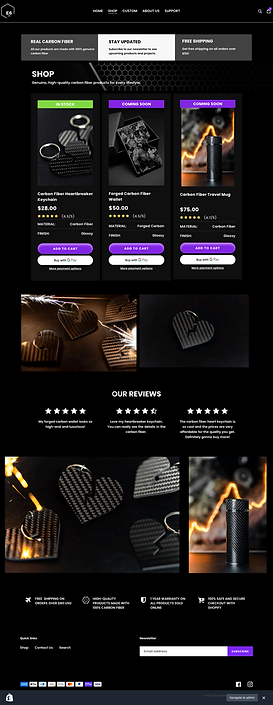
The chosen layouts for each page included a balanced composition using content blocks, bold imagery, and minimalistic UI elements and clear CTA buttons. I also thought of including automated purchase CTAs to speed up the checkout process and to increase customer engagement and revenue.


Stage 3
DESIGN
Design + Prototyping
Now that I've created the basic structure and layout of the website, I'll start adding content and brand colours to the mid-fi version. Once completed, I'll conduct a round of usability testing before designing the high-fi version.
Designing the mid-fi version involved creating website content and adding text blocks that were suitable for mobile and desktop screens. I focused on creating a balanced composition by using bold typography and images to separate content sections. The content in the mid-fi version wasn't final, but I wanted to conduct a round of usability testing to see if users had any difficulties or comments on the layout or content.


Final Results
After launching the website, users were able to browse products and checkout quickly. Revenue increased by 40% and customer engagement increased by 60%.
Since we spent a lot of time understanding the brand and what would make the website attractive to Millennial car enthusiasts, we were able to create a user-friendly and branded e-commerce website.
After conducting multiple rounds of testing, the task success rate was almost 100%. Since the results were so high, the client wanted to launch the website within 1 week.
To ensure the website was performing the same as our testing rounds, we examined sales revenues, website traffic and task completion. Based on our KPIs, revenue increased by 40%, customer engagement increased by 60% and shopping cart abandonment decreased by 80%.


